Website Design for Small Business: How to Create a Strong Homepage
A small business homepage has one job above all others: earn the next click.
That sounds simple until you look at how people actually use websites. They arrive distracted, skeptical, and short on time. They are comparing you to three competitors, answering a text, and trying to decide whether your business feels trustworthy enough to contact. Most of them will make that first judgment in seconds, not minutes. If your homepage is vague, cluttered, or slow to explain what you do, they leave. Not angrily. Just quietly.
That is why homepage decisions matter so much in website design for small business. The homepage is not a digital brochure. It is your best salesperson, your clearest sign on the street, and often the difference between a lead and a lost opportunity.
I have seen this play out across service businesses, local shops, medical practices, contractors, consultants, and nonprofits. Owners tend to focus first on colors, logos, and whether the hero image feels modern. Those details matter, but they are not what carries the page. A strong homepage works because it answers the visitor’s basic questions fast: What do you do? Who is it for? Why should I trust you? What should I do next?
When those answers appear clearly and in the right order, conversion rates usually improve. When they are buried under clever language, oversized sliders, or generic stock photos, even attractive sites underperform.
Your homepage is not for everyone
One of the most common mistakes in web design is trying to sound broad enough to appeal to everybody. Small businesses do this out of caution. They worry that if the message is too specific, someone will feel excluded.
The opposite tends to happen.
Specificity signals competence. If a landscaping company says it helps homeowners in The Woodlands maintain polished, low-maintenance yards that survive Texas heat, that message lands harder than “We provide quality outdoor solutions.” If an accountant says she works with small business owners who are tired of late books and tax season surprises, she sounds like she understands the problem. Visitors relax when they feel seen.
That matters even more in local markets. A phrase like web design The Woodlands is not just a keyword opportunity, it reflects how real buyers search. They want someone nearby or someone who understands the local business climate. Geography can be part of your credibility if you use it naturally and back it with substance.
A homepage becomes persuasive when it chooses a clear audience and speaks their language. You do not need to mention every possible service in the first screen. You need to convince the right visitor that they are in the right place.
The first screen carries more weight than most owners realize
Above the fold still matters, even though people scroll. They will scroll if the top of the page gives them a reason to. If it does not, they bounce.
The opening section should do four things quickly:
- State what the business does.
- Indicate who it serves or where it serves them.
- Offer a practical reason to trust it.
- Present a clear next step.
That is not a creative limitation. It is a clarity discipline.
Consider the difference between these two opening messages.
The weaker version says, “Building better digital experiences for modern brands.”
It sounds polished but says almost nothing. What kind of business is this? Does it build websites, run ads, create software, or handle branding? Is it for national brands, local businesses, or startups? The visitor has to work too hard.
The stronger version says, “Custom website design for small business owners who need more calls, bookings, and quote requests.”
Now the message has traction. It names the service, the audience, and the outcome. You can make it more local or more industry-specific from there. A business serving Southeast Texas might refine it further by mentioning the region or cities served. A niche agency could mention attorneys, med spas, contractors, or home service companies.
The first screen is not the place to be mysterious. It is the place to be unmistakable.
Strong headlines beat clever headlines
Many homepages fail because the owner or designer falls in love with branding language that sounds expensive but communicates very little. Clever wording can work in established consumer brands with high recognition. Small businesses rarely have that luxury.
A strong homepage headline is usually built from familiar words arranged with precision. It does not need to win an award. It needs to make sense immediately.
A reliable formula is to combine service, audience, and benefit in one line. For example, a local firm offering web design could say, “Website design for small business owners who need a site that actually brings in leads.” It is plainspoken, but plainspoken often converts better than abstract copy.
Subheadings carry the burden of detail. This is where you can mention turnaround expectations, service areas, your process, or a differentiator such as in-house photography, SEO fundamentals, or ongoing support. The headline gets attention. The subheadline reduces uncertainty.
That balance is essential. Oversell, and the page feels slick. Undersell, and the value disappears.
Design is trust made visible
People often say they want a website that “looks professional.” What they usually mean is that they want a site that feels trustworthy.
Trust in web design comes from a cluster of signals working together. Visual quality matters, yes, but it is only part of the equation. Spacing, typography, image choice, page speed, consistent branding, and clean mobile behavior all send cues. So do smaller details that owners sometimes miss, like whether buttons look clickable, whether testimonials feel real, whether contact information is easy to find, and whether the site appears current.
Nothing undermines trust faster than a modern homepage with stale content. I have seen sites with beautiful layouts and a “latest news” section that has not been updated in four years. That tells visitors the business may not be paying attention. Dead social icons do the same thing. So do broken links, blurry photos, and forms that submit to nowhere.
Good design is not decoration. It is reassurance.
This is particularly important for small businesses, because visitors do not have the built-in confidence they might extend to a major national brand. They are looking for signs that your business is established, responsive, and competent. The homepage has to make that case visually before anyone reads deeply.
Show people the next step without making them hunt
Many homepages lose leads because they force visitors to guess what to do next. If you want calls, make the phone number prominent. If you want consultations, place clear booking buttons where people can see them without scrolling forever. If quote requests matter, say exactly what the form is for and how quickly you respond.
Calls to action should match buyer intent. A visitor who is just learning about your business may not be ready for “Start your project now.” That can feel premature. “Schedule a free consultation” or “See our work” may be more natural. On the other hand, a service like emergency plumbing or urgent care needs direct, immediate action.
The strongest homepages often repeat the primary call to action in several natural places. Not aggressively, not with flashing banners, just consistently. One near the top, one after trust-building content, and one near the bottom often works well.
Button labels matter more than people think. “Submit” is weak. “Get a free estimate” tells the user what happens next. “Book your consultation” is stronger than “Learn more” when the user is ready to act.
A homepage should reduce decision fatigue, not add to it. Too many competing actions usually hurt performance. Pick the main conversion goal and support it clearly.
The middle of the page is where doubt gets answered
Once a visitor understands what you do, the next question is whether you can do it well for them.
This is where many homepages either overstuff the page with every detail or stay too thin to be persuasive. The better approach is to use the middle sections to answer objections and remove friction.
If the buyer is likely wondering about pricing, you do not always need exact numbers, but you may need framing. A designer might explain that costs vary based on page count, features, and content needs. A home remodeler might mention that every quote is customized after a walkthrough. This kind of context reassures people that there is a process behind the price.
If timing is the bigger concern, speak to timing. If trust is the issue, show credentials, years in business, recognizable clients, or before-and-after results. If people worry your business scalablewebsites.com web design the woodlands is too far away, clarify your service area.
This section is also where concise service summaries earn their keep. You do not need to flood the homepage with every sub-service. You do need enough detail to help visitors self-identify. A roofing company might distinguish repairs from full replacements. A marketing firm might separate web design, local SEO, and content support. A bakery might make clear whether it handles custom cakes, everyday pastries, or wholesale orders.
The point is not completeness. The point is orientation.
Proof beats promises
If there is one principle I would press on every small business owner, it is this: do not ask visitors to trust claims that you could demonstrate.
Saying “we care about quality” does almost nothing. Showing polished project photos, specific testimonials, and concrete outcomes does much more.
The most persuasive proof on a homepage usually includes a mix of social validation and visual evidence. Testimonials work best when they sound like actual people, not marketing copy. “They redesigned our site and we started getting more qualified calls within the first month” is believable. “Their unparalleled excellence transformed our digital ecosystem” is not.
Case studies are powerful if you have them, especially for service businesses with measurable outcomes. If exact figures are sensitive or variable, you can still talk about results in grounded terms. More quote requests, fewer customer questions, better mobile usability, improved appointment completion, stronger local visibility. You do not need to inflate the claim.
Photos matter too. Original imagery often outperforms stock photography because it answers an unspoken question: is this a real business? A professional photo of your team, storefront, workspace, or completed projects carries weight. Visitors notice authenticity even if they cannot articulate why.
For a company selling web design, this is doubly true. A homepage promising beautiful websites should itself be easy to use, fast to load, and convincing on mobile. Every pixel on that page is part of the pitch.
Mobile is not a secondary experience
For many small businesses, more than half of homepage traffic comes from phones. In local service categories, that number can climb higher. Yet I still see homepages designed on desktop first, then awkwardly compressed to fit a smaller screen.
Mobile users are impatient in practical ways. They want tap-friendly buttons, readable type, short paragraphs, fast page speed, and obvious access to the phone number or form. They do not want tiny text over a giant background image or popups that swallow the whole screen.
A homepage that feels polished on desktop but frustrating on mobile is not polished. It is unfinished.
This matters for search visibility as well as conversion. Search engines have long rewarded mobile usability, and users punish poor mobile experiences immediately. If your site loads slowly on cellular connections or forces users to pinch and zoom, they will not stay long enough to admire the branding.
A strong mobile homepage often strips away nonessential elements and leans into clarity. Better one good image than five decorative ones. Better a short benefits section than a wall of copy nobody reads on a phone. Better one high-contrast button than three subtle calls to action competing for attention.
Local businesses need local signals
If your small business depends on a service area, your homepage should reflect that reality. This is where many local sites leave money on the table.
Your city, region, or neighborhood can be woven into the homepage naturally through headlines, subheadings, service descriptions, testimonials, and contact details. The keyword web design The Woodlands, for instance, makes sense on a page if the business genuinely serves clients there and can support that claim with examples, local knowledge, or a nearby office. The same principle applies to any town or metro area.
Local trust signals go beyond place names. Mentioning response times, service coverage, permits, community involvement, or familiarity with local customer expectations can help. For some businesses, even practical details like “same-day visits in most nearby neighborhoods” are more persuasive than lofty statements about excellence.
This is also where embedded maps, local reviews, and geographically relevant project examples help. They make the business feel tangible, not abstract.
A homepage should not read like it was cloned from a generic template and had the city name swapped in afterward. Visitors can feel that. Local relevance needs texture.
Simplicity usually wins, but not the simplistic kind
There is a difference between a simple homepage and a thin one.
A simple homepage has a clear message, enough proof, intuitive navigation, and thoughtful spacing. A thin homepage omits essential context and leaves visitors with unanswered questions. Owners sometimes hear that modern sites should be minimal and interpret that as “say less about the business.” That is rarely the right move.
The better goal is economy. Every section should earn its place. If a section explains nothing, proves nothing, and advances no decision, remove it. If a section helps the visitor understand, trust, or act, keep it and make it tighter.
Here is a practical gut check I use when reviewing homepages:
- Can a first-time visitor tell what the business does within five seconds?
- Is there visible proof that the business is credible?
- Is the main call to action obvious?
- Does the page work just as well on a phone?
- Would a real customer feel understood by the wording?
If two or three of those answers are shaky, the homepage needs work, no matter how nice the layout appears.
Common homepage mistakes that quietly drain leads
Some weak homepages fail dramatically, but most fail quietly. They look acceptable. They even get compliments. They just do not convert as well as they should.
One frequent problem is leading with the business name instead of the business value. Unless your brand is already well known, the visitor cares first about relevance, not identity. Another issue is writing copy from the company’s point of view rather than the customer’s. Pages full of “we” language tend to underperform pages that connect services to visitor needs.
Then there is the habit of trying to say everything at once. Too many homepage sections, too many services in equal weight, too many sliders, too many animations, too many badges. When everything is emphasized, nothing is emphasized.
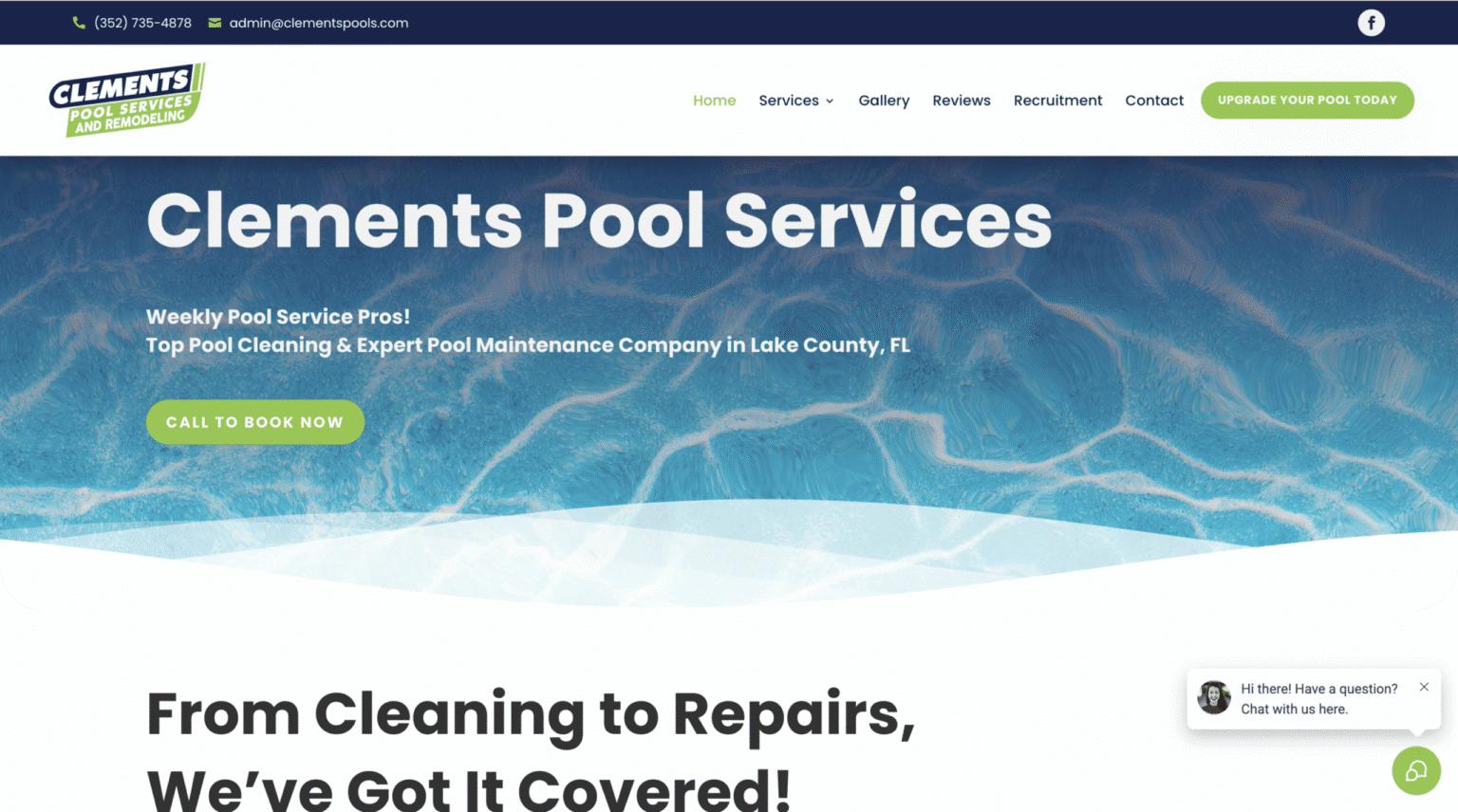
I also see businesses bury strong proof low on the page. If you have great reviews, real project photos, years of experience, or recognizable clients, do not hide them. Bring those signals forward.
One more problem deserves mention: vague navigation. A homepage cannot carry the whole website, but it should direct people logically. If the menu labels are unclear or too cute, users hesitate. Standard labels like Services, About, Portfolio, Pricing, and Contact may not feel inventive, but they reduce friction. Familiarity is useful when someone is trying to make a decision quickly.
What a strong homepage often includes
Not every homepage needs the same structure, but most successful ones share a handful of ingredients arranged in a sensible flow.
The top section introduces the business clearly, followed by a short explanation of the service or value proposition. Then comes trust, often in the form of testimonials, client logos, review counts, years in business, or selected results. After that, the page usually provides a practical overview of core services or common customer needs, supported by examples. Toward the end, the page removes remaining doubts with FAQs, service area details, or process notes, then repeats the call to action.
That flow works because it mirrors decision-making. First clarity, then confidence, then action.
If your business is highly visual, such as interior design, landscaping, or cosmetic services, your homepage may lean more heavily on imagery. If it is compliance-driven or high-trust, such as legal, medical, or financial services, credentials and precise wording may matter more. If you offer web design, visitors will judge craftsmanship and strategic clarity at the same time. The homepage should prove that you can design not just for aesthetics, but for business results.
A homepage is never just a homepage
The best small business websites treat the homepage as the front door to a larger conversion system. It has to connect smoothly to service pages, contact pages, case studies, reviews, and sometimes booking tools or ecommerce. If those downstream pages are weak, the homepage can only do so much.
Still, the homepage sets the tone and determines whether visitors continue. That is why it deserves more attention than a quick template swap and a few edited headlines.
If your current homepage gets traffic but not many inquiries, the issue may not be your market. It may be your messaging, your hierarchy, your proof, or your calls to action. Those are fixable problems. Often, the businesses that see the biggest lift are not the ones that redesign from scratch. They are the ones that sharpen the message, simplify the path, and align the page with how real customers make decisions.
A strong homepage does not need to be flashy. It needs to be clear, credible, and easy to act on.
That is what persuasive website design for small business really comes down to. Not trends. Not jargon. Not impressing other designers. Just building a page that helps the right visitor say yes to the next step.
Scalable Websites
Website design for contractors and small businesses
Based in Montgomery, TX, serving Montgomery County and greater Houston
Phone: (832) 979-2478
Website: scalablewebsites.com
Hours: Monday to Friday, 8 AM to 5 PM
Scalable Websites builds and manages mobile-first websites for contractors and small businesses on simple monthly plans, with hosting, security and unlimited updates included. Find us on Google.